
Designing Paywalls for changing business needs
As the business evolved, we adjusted our pricing plans, implementing more restrictive feature fencing to encourage upgrades. My role involved designing new patterns to align with the business needs.
Key Results
- ↑ 2X increase in contact sales form submissions
- ↑ 17% conversion to paid plan post fencing
Role & Time
- Lead Product Designer
- 1 month

hero image
Challenge
Most users were satisfied with our Freemium plan and did not see enough value in upgrading to the Pro plan. Our goal was to restrict Freemium features strategically, making Pro more compelling while ensuring Freemium remained attractive to new users switching from competitors.
Research & Insights
Understanding industry patterns
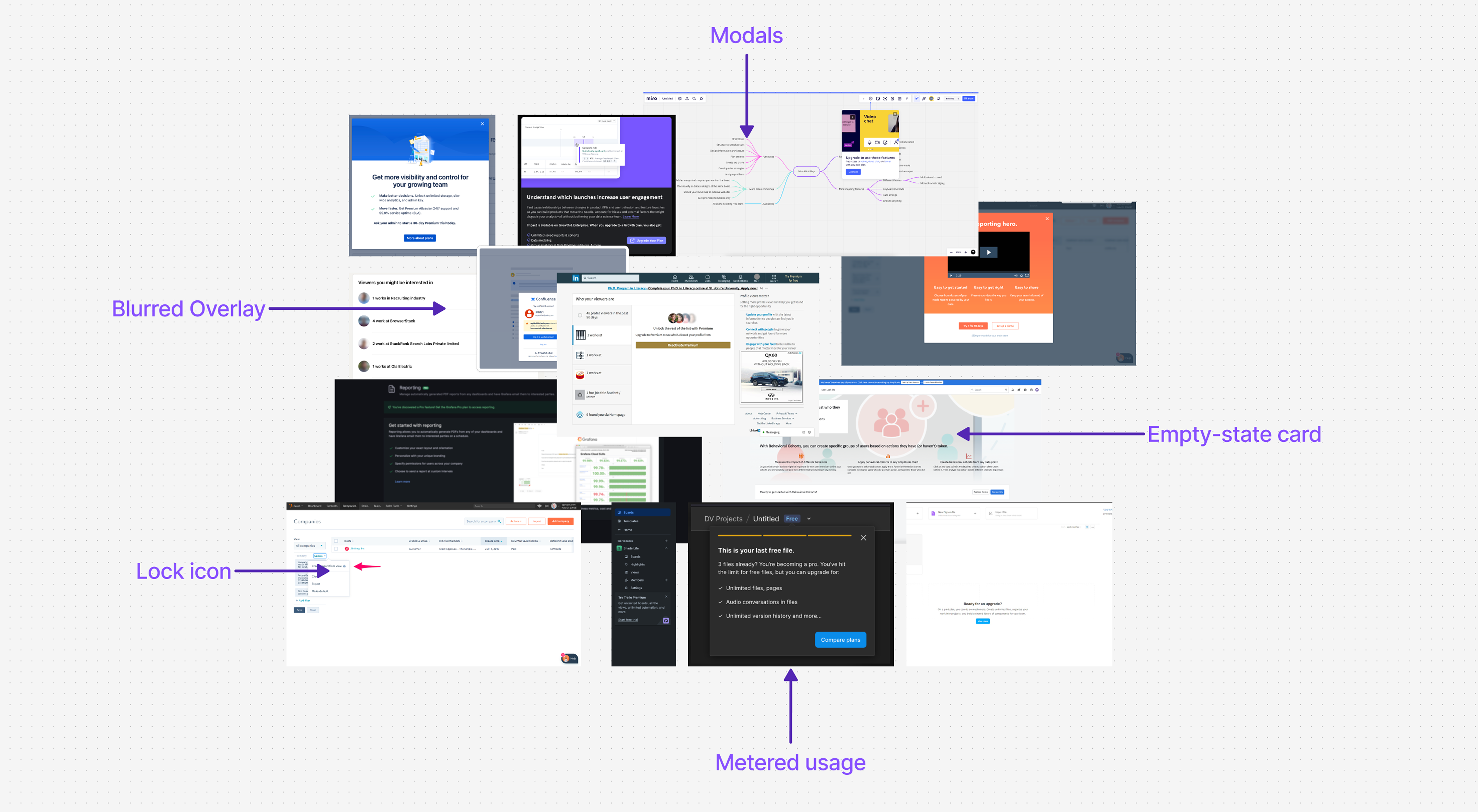
To determine the best approach, I studied different feature fencing models across the industry:
Soft fencing (e.g., Figma, Miro, LinkedIn) – Users can try features in a limited way before upgrading.
Hard fencing (e.g., Netflix, news sites) – Features are completely locked behind a paywall.
Metered fencing – Users get a limited quota before requiring an upgrade.
Key Findings
- → Pro tags and locked icons were commonly used to indicate restricted features.
- → Blurred content overlays created intrigue and encouraged upgrades.
- → Usage indicators helped communicate limits and anticipate restrictions.
Previous Freemium Model
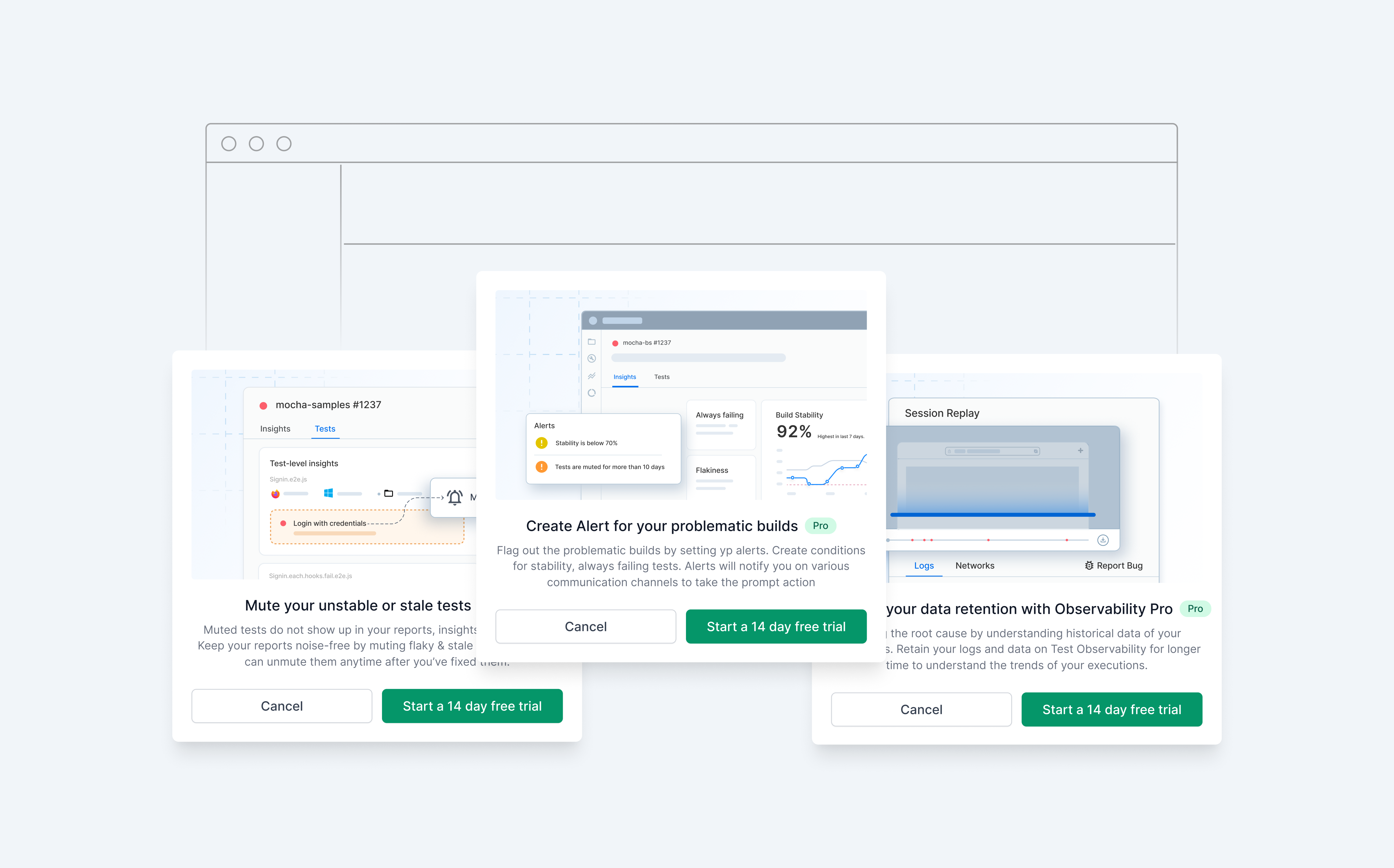
Our initial freemium model offered most features for free, with some metered restrictions on high-demand features—similar to Miro, where users could try features in a limited way before needing to pay.
Design Explorations: Creating new Patterns
To create paywalls, I explored three approaches: empty states, new card designs, and blurred overlays.
After reviewing these options, I aligned the team to integrate blurred overlays into the design system, making it the ideal paywall solution.
Reverse Engineering
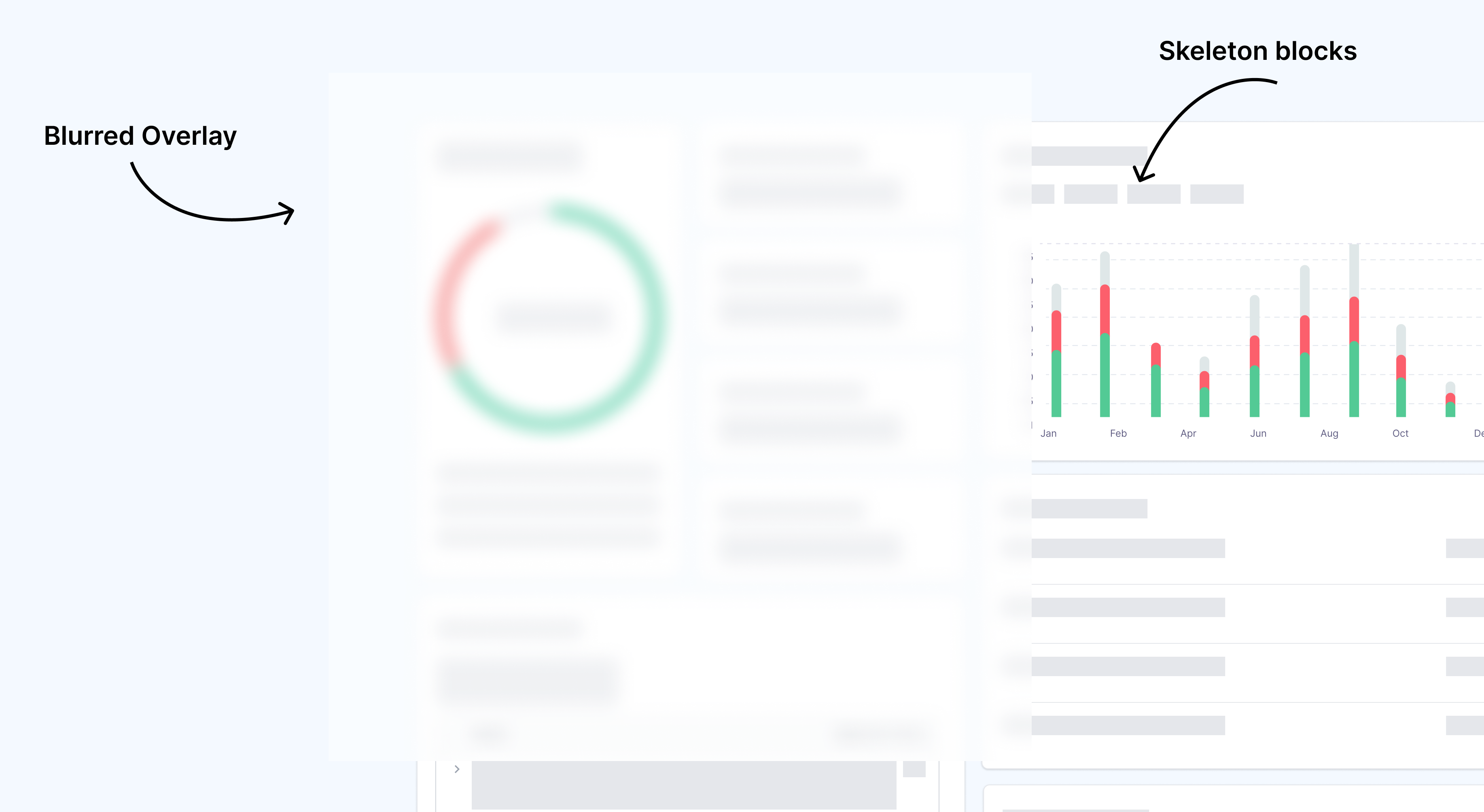
One of the biggest challenges was implementing blurred overlays seamlessly. Data behind the overlay was the reason of concern as target users of the product-QA's could easily manipulate CSS.
I analyzed how other companies achieved this, and developed a solution with front-end team to enter dummy data for a smooth user experience.
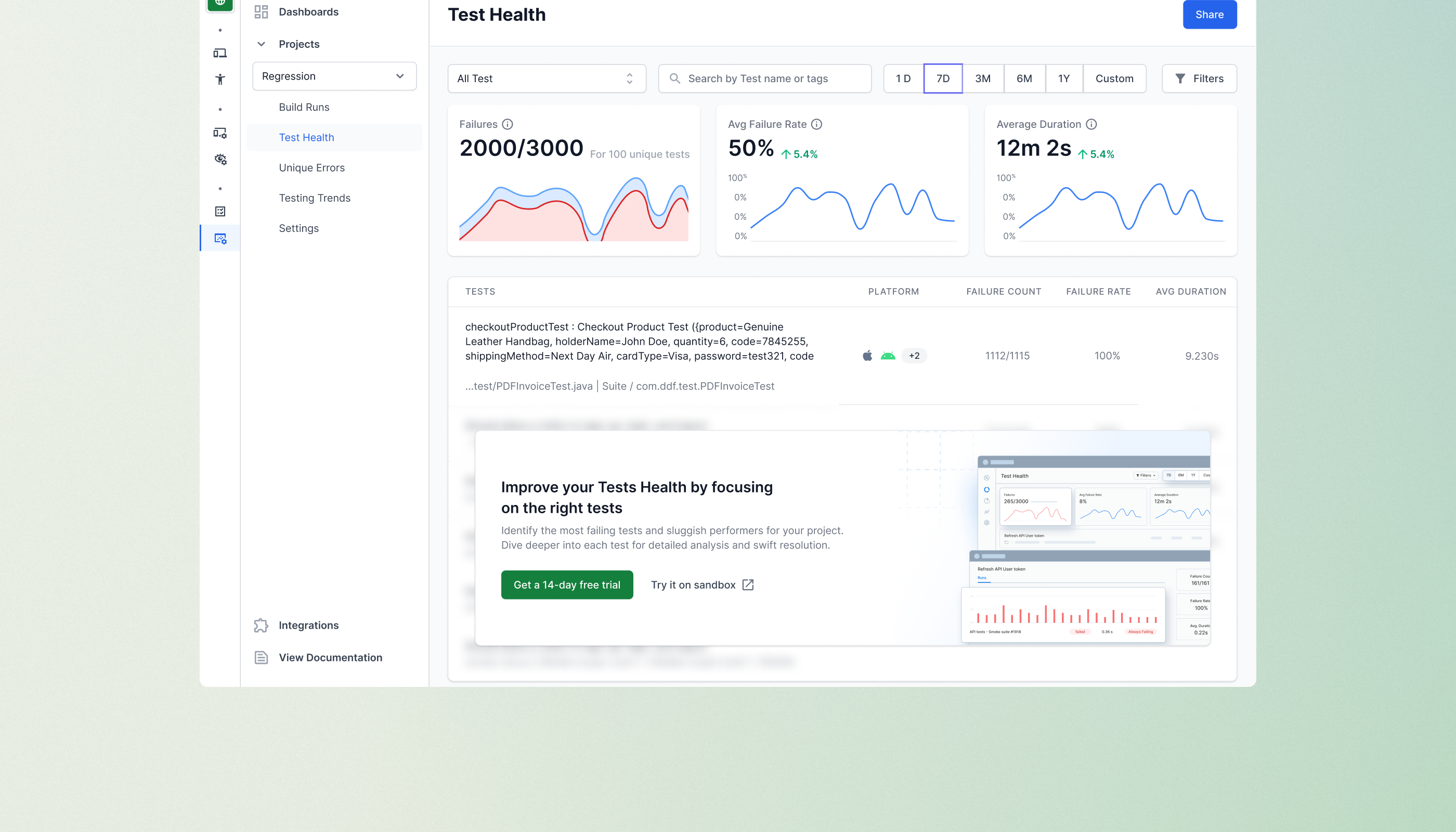
Final Solution
Design Showcase
Communicating usage
One of the important aspect of fencing is to communicate usage. We created in product touch point where users could monitor the usage.

Warning before restrictions
To warn users about the limits we used alerts within products as well as email notifications increasing upgrade touchpoints at the same time keeping users informed.

Extending the pattern usage
I extended the blurred overlay pattern to other parts of the product to maintain consistency and reinforce the value of the Pro plan.
